When Selections Define Your Image
Over the past few weeks, I’ve discussed various basics of creating and selecting areas of your image, and today, we’ll have a bit of fun with it – to give you an idea of the power that is at your fingertips. Beware – for your image is not what it seems to be! Today, we’ll create entire images from selections, and the results may surprise you.
Before starting this tip, you may want to review the previous few tips I’ve posted on TipSquirrel. In those lessons, we established a common language for speaking about selections, and we developed a few basic techniques that are simple, but provide tremendous capability for image manipulation. If you aren’t familiar with these concepts, or need a refresher, please see the following tips:
Photoshop Selection Techniques
Photoshop Selection Power Tips
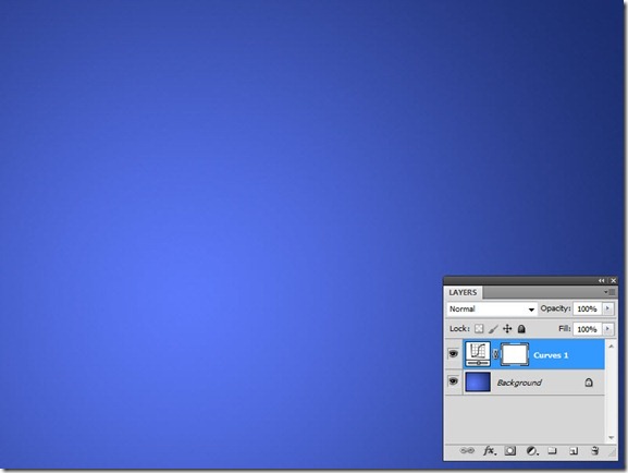
OK, so let’s dive right in. We’re going to start with this simple flat file, where we have a background layer with a smooth gradient:
Now, without adding any actual graphical elements, we can make our image do some amazing tricks. Let’s start by adding a Curves adjustment layer (Layer > New Adjustment Layer > Curves…). Click OK to accept the default parameters, and nothing happens, except we have a curves layer:
Now, pulling up or down on the curve in the Adjustments Panel will change the image globally, but let’s make one small change before we adjust anything. Let’s add a gradient in the layer mask of the Curves 1 layer. Remember from our earlier lessons that “Black conceals, White reveals;” wherever the layer mask is white, we will see the curves adjustment – wherever it is black, we won’t (and for shades of gray, we will see it revealed only partially).
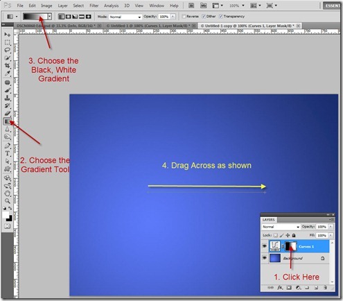
Here’s the process:
Select the Curves 1 Layer Mask
Select the Gradient Tool
Choose the Black, White gradient (first one in the list)
Drag as shown to create the gradient layer mask
Now that the gradient is in the layer mask, the Curves adjustment will only be visible where the mask is white, and will be partially visible where the mask is gray. Let’s open the Adjustments panel (Window > Adjustments) and make the following adjustments to the curve:
1. Click in the center of the curve and drag upward. The values (which can be adjusted manually as shown) should reflect an input value of 127 and output of 210:
2. Now click at about the 3/4 point of the curve and drag downward. The values for the new point should reflect an input of 190 and an output of 20:
Now, look what has happened. In the area where the gradient in the layer mask is white, we are seeing some changes to the image. Where the mask fades to gray, the adjustment fades with it. And in the areas of black mask, there is no adjustment at all.
Now let’s put this to some practical use. Let’s start with a similar document with a smooth background. This time, use the Custom Shape tool to add a path outline (not a shape layer) over the image:
Next, Control-Click (Mac: Command-Click) on the path in the Paths panel in order to load the path as a selection:
Now we have a selection active in the shape of the path. Create a Hue/Saturation Adjustment Layer (Layer > New Adjustment Layer > Hue/Saturation…). Notice that when we have an active selection, a mask is created automatically in the shape of our selection on the new adjustment layer. The selection becomes inactive, but it has been incarnated in the layer mask itself:
Now when we start making our Hue/Sat adjustments, the changes will be visible only in the selected areas – Black conceals, White reveals. Change the Hue/Sat values as shown:
We’ve just created a graphical element in our image using only an adjustment layer with a layer mask!
We can use this principle to create some interesting effects if we use a more complex mask. Recall from our previous tip that a selection is a channel, and a channel can become a selection. Let’s take another flat image as an example:
To a layer above this background, temporarily add an image with some interesting graphic elements. In this case, I’m using a photograph of a tiger:
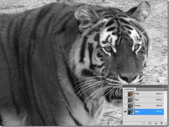
Switch to the Channels panel, and view the color channels to see which one has the best contrast. In cycling through the color channels, we can see in this case that Blue is the highest contrast channel:
Now we want to load this as our selection. Recall that we can do this by Control-clicking (Mac: Command-clicking) on the channel thumbnail. Then, click on the RGB channel to return to the composite color image:
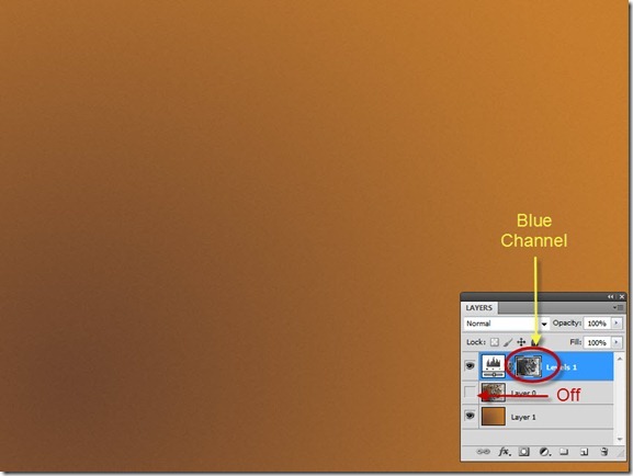
Now with the selection active, add a Levels adjustment layer (Layer > New Adjustment Layer > Levels…) Notice that the blue channel is now copied into the levels layer mask.
At this time, turn off the image of the tiger, it is no longer needed.
With the layer mask containing the image from the blue channel, the Levels adjustment will be modified according to the black, white and gray of the mask. Let’s adjust the levels as shown by dragging the midpoint slider to show a value of 1.79:
Notice how the levels adjustment, through the mask, gives us a nice monochromatic rendition of the tiger image! Now for some finishing touches: first, get the move tool, select the layer mask, and shift-drag the mask over to the left (this creates a nice graphical bar on the right side, since the right side of the mask becomes black, hiding the adjustment):
And at this point, we just add some text and information to our image, and we have an interesting poster with a cool screened background image:
That’s it for this week! I hope you have learned something today. I’ll see you again next week, and in the meanwhile, I wish you all the warmest season’s greetings.


Leave a comment