The Long And Winding Road
by Janine Smith
The use of the postcard first began in 1861 when a copyright was issued to one John P. Charlton of Philadelphia, Pa. The first cards, called “postal cards” or “postals”, were simply a plain card with the country’s postal stamp imprinted on them. Writing was not permitted on the address side of any postcard until 1907, so many cards found today from this era have messages written across the front. It’s widely held that the picture postcard actually began at the 1893 Columbian Exposition in Chicago when illustrations of the buildings and views of the Exposition were printed on both government postals and souvenir cards, although earlier examples have been found, one actually postmarked 1848! Regardless of when they began, the postcard has long been a favorite tool to market to the tourist and collector, alike.
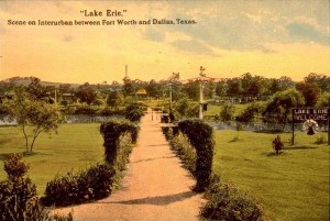
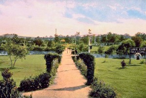
Cards in the early 20th century were colored or enhanced, to portray an idyllic view of whatever attraction was being shown. When restoring these old postcards, you ideally want to recapture that look and feel. Sometimes – most of the time – that takes more than one filter or adjustment. In my work restoring historic photographs for a Fort Worth website, I’ve run into a rather large collection of historic postcards depicting Lake Erie, an old, now long gone, attraction of the day which included a boardwalk, boat rides and an amusement park. Most of these cards, or the copies of them at my disposal, are rather on the pink side. Some have more of a yellow cast. I’ve been lucky enough to have been able to see and digitize one of the original cards (not the one used as an example, by the way), which has held up beautifully over the years, which allows me to see how the cards were actually meant to appear. Now, the winding road from this:
To this:
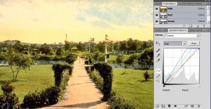
The first thing I like to do with these postcards is run a Curves Adjustment. Do it the old school way: Black Eyedropper on the darkest part of the image, White Eyedropper on the lightest, or white, part of the image. I bring the opacity down to about 70%. I’m going for enhanced, not frightening.
Nice yellow doomsday cloud effect, but not what we’re going for this time! Now, we’ll send it through the Levels Adjustment cycle! Same as on the Curves, go old school with the eyedropper; use the same black and white points as in the previous adjustment. The Opacity comes down to about 60% on this adjustment. Baby steps are good…
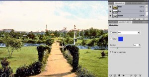
Looking much better, but I want to bring up the blues, slightly. Very slightly. So a Hue/Saturation Adjustment is next. I masked out all the photo except the relevant areas, in this case the stream. Again, lower the opacity to around 70%. Glowing water is not good… Now I want to get the last bit of yellow cast out. I chose to do this using a blue Photo Filter Adjustment at the default settings…
…and bring the opacity down to around 50% on the layer itself. I mask out the green areas, because I want them to remain warmer, hence leaving the yellow cast be. Now I’d like to tone down the blown-out sky just a bit, and for this, I’ll use a little Exposure Adjustment.
Go very light on Exposure Adjustments – they’re great to help correct a bit of blow out sometimes, but can get really bad looking, really fast! I use a setting of -31%, then bring it further down in the layer by lowering the Opacity to 40%. Mask out all areas except the sky, here. We don’t want our hard earned brightness dulled.
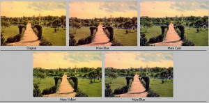
Now, just for fun, let’s do something really old school! Variations! Yes, you heard correctly. Variations. Why, you may ask? Because I still think it’s a valid color correction tool, worthy of at least a drive by, every now and then! My one big problem with Variations is the interface itself, but that’s another story. Make a copy of all the previous layers (Shift+Ctrl+Alt+E on a PC). Go to Image > Adjustments > Variations. You always have to let your eyes really do the work, here. Keep your eye on the top two selections, Original and Current Pick to gauge where you’re at. I put a Blue, Cyan and Yellow filter on the photo, then topped it off with another hit of blue.
I then lowered the Opacity down to 75% in the layer. This brought a little of the yellow back in the clouds, but also some pink. Sometimes you end up just a little left of where you were three steps ago, but that’s all part of the great experiment! In this case it brought back some definition that was lacking, previously. The final step will be to punch the over all pop up just a tad, using another Hue / Saturation Adjustment and bringing the Saturation up to +10 or thereabouts.
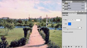
Now, anyone who does any kind of work like this knows it’s a process of give and take, try, try again and do overs. The technical term is “tweaking”. A long and winding road, indeed! Therefore, we’re not quite done, yet. One more tweak to tone down the yellow clouds, while keeping the pink. Another Photo Filter Adjustment is called for, this time the Cooling Filter (80).
Now we have a postcard featuring an idyllic setting to temp the turn of the century family for a day of fun!
Where to Find Janine






Leave a comment