
Quick Tip: Perfect Black & White
Good news: Perfect Photo Suite 8 from onOne Software is almost here! You can download a public beta right now, and today we’ll take a look at one of my favorite aspects of this suite: the Perfect Black & White module.
The first thing you’ll notice if you’ve used the Perfect Suite before is that the user interface is brand new and very slick. The whole cast of characters now use the same UI, which has a similar look and feel to Lightroom, and is more responsive compared to some older versions of these plugins. (Some of the previews can still take a second to catch up to your mouse, but all in all much better in this version.)
You can use all of the modules as plugins via Photoshop or Lightroom (or Elements), or you can use the stand-alone app, which we’ll look at here. You will start out in the brand new Browse module, which is like a simplified version of Bridge or the Lightroom Library module. It is much more about finding as opposed to categorizing and organizing; there are many cloud services this new browser can connect to as well.
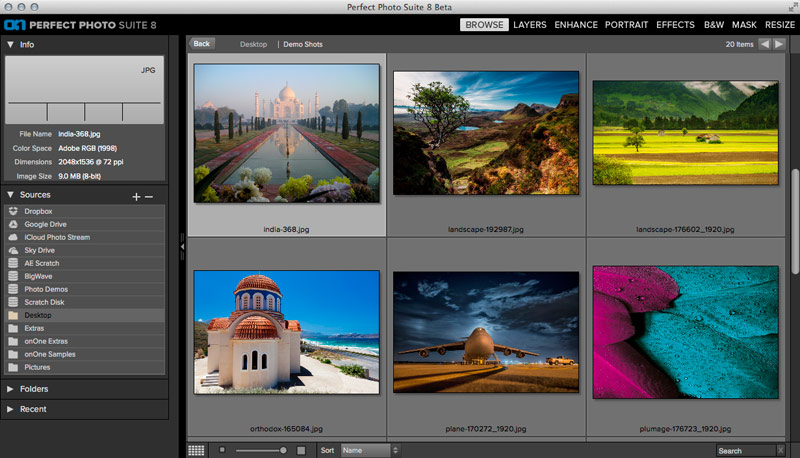
To move your photo from the browser into your module of choice, select the shot and click the module’s button at top-right. You’ll be asked if you’d like to edit a copy or the original (I always recommend a copy), and are given some basic choices about file format, color space and the like. Here I’ll use the same settings as the defaults from the JPEG file I’ll be using as a demo. Once you’re in Perfect Black & White, the new UI makes everything easy to find: presets at left, main preview and tools for direct interaction at center, specific preset and filter controls at right (for customizing the pre-defined looks the module ships with).
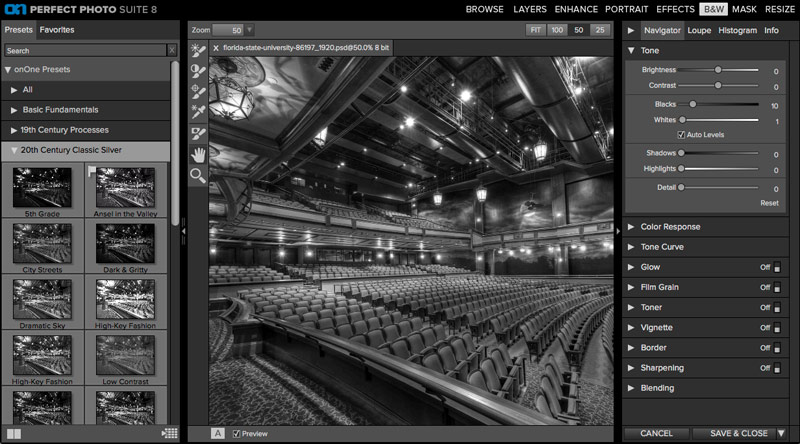
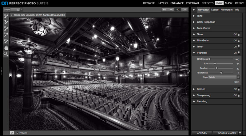
I chose a creative commons image in this case, because I wanted to find a dramatic shot of indoor scenery (something different from the landscapes and urban scenery I typically shoot). It’s best to start with a source that has a wide range of large and small details, and a wide range of tones. In fact, even some of your favorite HDR shots might be a fun place to start! Here we have a really cool looking theatre from Florida State University (as legend has it), that has a great amount of color and contrast, and so is perfect for black and white.
The first thing you’ll want to do is choose a preset from one of the main categories available at left. I like old-school presets for classic subject-matter like a theatre, so I chose the 20th Century Classic Silver category. And within that the “Spot Light” preset seemed appropriate in more ways than just the name, having rich blacks and good detail relief. It’s a good starting point, which you can see below.
Because there are 10 separate groups of controls and several tools that we can use to localize our settings to specific parts of an image, there are countless variations to match your taste, but here we’ll do a quick pass with some of my favorite settings.
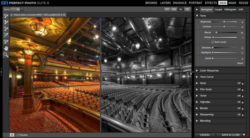
First thing’s first: use the Tone panel to tweak the overall brightness and detail, as well as contrast. Here I revealed some extra details around the periphery of the shot by boosting the Brightness slightly and increasing the Shadows setting (which works like the shadow recovery options in ACR and Lightrooom). I brightened the whites a bit as well, to focus on the house lights some, and also reduced the default Detail setting to remove the fakey HDR texture and reduce the overall contrast a bit (especially on the chairs, which I didn’t want to become a focal point).

Next I jumped down to the Toner panel, which works just like Split-Toning in ACR and Lightroom (sensing a theme here?). This panel has a long list of useful presets to get you started. Predictably, I arrived at the decision that a Selenium based option was good here (being one of my favorite traditional processes for classic subjects like this one). To customize I increased the Balance a bit. Because this preset does not use highlight toning, this meant a subtle reduction in the overall strength. I also decreased the Shadow strength a bit, leaving just enough to be detectable.

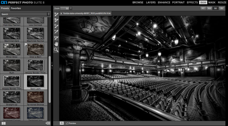
Last but not least this image had too much vignette to start. Too many interesting details are darkened down in the corners, so I opened that panel and switched its preset from Normal to Subtle (which took me a little too far in the other direction). From there I added a bit of vignetting back by reducing the Brightness, Size and Feather values until the corners were slightly darkened (definitely more so than with no vignette) but the interesting house lights (top left) were much more interesting to look at than before. The final result is shown below. When you’re done you can either save and close with the button at bottom right, or save and jump to another module by holding down the Save & Close button. That simple!
If you haven’t downloaded the beta suite yet, go ahead and give it a go. It will give you a chance to see if these plugins help your workflow, and it will make buying more of a no-brainer when Perfect Black & White and the suite are released in a few days. To keep up to date on upcoming tutorials for this suite and more, follow me on Twitter. Have fun!
Leave a comment