Creating a Glittery Text Effect in Adobe Photoshop
 Tutorial assets:
Tutorial image (with rasterised text layer)
Sparkle Brush
Hello everyone.
Inspiration often comes from things we’ve seen as we go about out day-to-day business; posters, TV and printed ads, etc. I was in town the other day and noticed a poster in a bus shelter for a soft drink. The ad headline featured a fancy glittery text effect. I took a photo with my phone for reference and set about seeing what I could come up when I got back to the computer. I wanted to make sure it was easy to create and versatile enough to apply in different situations. Here’s the result.
 1. We’ll start by creating a new document. Go to the File menu and select New; alternatively press Cmd+N (Mac) or Ctrl+N (PC). For this image we’ll use the following dimensions: Width 1000 pixels, Height 440. We’ll set the background to white for the time being as it makes it easier to work on the design. Click OK to create the document.
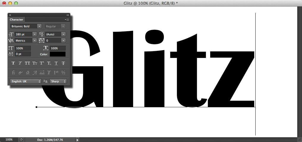 2. Next we’ll add our text. Grab the Horizontal Type Tool from the toolbox, or press its keyboard shortcut T. The font we’ve used here is Brittanic Bold. If you don’t have it, you can substitute it for a similarly bold typeface. Set the size to 380pt; this will fit nicely on the canvas. Press D to reset to the default foreground and background colours. Click on the left side of the background to create a new type layer; don’t worry too much about the positioning at the moment, we can always adjust it later. Type the text as shown. Click the tick to commit the text.
 3. Now we’ll start to build up the glitter effect. Filters generally need a solid layer to work on. This can be any colour but it’s best to use a neutral as the base colour can affect the results; it also gives us more flexibility for blending. Click the New layer icon in the Layers panel to add a new layer above the text. Go to Edit > Fill. Select 50% Gray for the contents. Make sure the Blending is set to Normal and the Opacity is 100%. Preserve Transparency should be unchecked. Click OK to fill the layer.
 4. We need a random pattern to create the effect. Go to Filter > Filter Gallery. Go to the Texture section and select Grain. We want a lot of variation in tone here. Select the Regular preset from the Grain Type menu. Now increase the Intensity to its maximum; we get this wild speckled effect. Now drop the contrast to 0, this takes away the stronger black and white elements; we need an even spread for this part of the technique. Click OK to apply the effect.
 5. At the moment we have a TV interference effect; it’s not looking particularly glitter-like. We need to make change it to a uniform colour. Go to Image > Adjustments > Hue/Saturation. We could also use the keyboard shortcut Cmd+U or Ctrl+U. The first thing we need to do is click the Colorize box. This essentially removes the existing colour of the layer and replaces it with a single hue. We now have a drab red. Increase the Saturation slider to around 70-80. This gives us an nice deep scarlet colour. Click OK to apply.
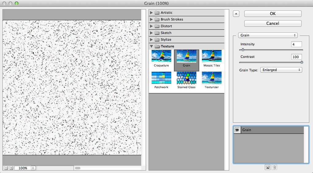 6. The effect is starting to shape up but it’s still not quite there. Create a new layer above the current layer. Fill it with 50% Gray as before. Go back to the Filter Gallery. We still want the Grain filter but we’ll make some changes. Set the Grain Type to Enlarged. Now drop the intensity to around 4. Increase the Contrast to 100. This time we get this much harsher pattern of greys and whites; this will give some accent to the texture. Click OK to apply the effect.
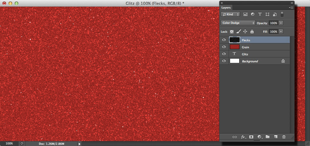 7. We want the flecks to be white against a dark background. Go to Image > Adjustments > Invert. We could also use the keyboard shortcut Cmd+I or Ctrl+I. Go to the Layers panel. Set the blend mode to Color Dodge. The layer blends into the grain beneath, giving us a more varied effect with some pin-prick highlights. This is looking much better but it’s still a little flat.
 8. We could use a Levels or Curves adjustment to adjust the contrast of the layer to give us a richer effect but there’s a quicker way. Go to Layer > New > Layer via Copy, or press Cmd+J/Ctrl+J. This duplicates the flecks layer. Now go to the back to the Layers panel. Change the blend mode of this layer to Soft Light. This gives us an instant contrast boost; we now have a deeper set of tones that looks much more glitzy.
 9. That’s the effect itself done so let’s apply it to the text. First, we’ll merge the effect layers into one. Click the red grain layer’s thumbnail in the Layers panel. Now, holding the Shift key, click the top layer’s thumbnail. All three layers will be highlighted. Go to Layer > Merge Layers, or press Cmd+E/Ctrl+E. We now have a single glitter layer. Go back to the Layer menu. Select Create Clipping Mask; keyboard shortcut Cmd+Opt+G or Ctrl+Alt+G. Now the effect is only visible where it meets the text.
 10. Next, we’ll add a slight bevel edge to the text, this will give it more of a three-dimensional appearance. Click the text layer’s thumbnail to make it active. Click the fx icon in the Layers panel. Choose Bevel and Emboss. Select Inner Bevel for the Style. Set the Technique to Smooth. We’re going to keep the effect fairly subtle. Change the Depth to around 36%. Now set the Size to around 10px and the Soften amount to around 11px; these values will vary depending on the size of the image you’re working on. Leave the dialog open for now.
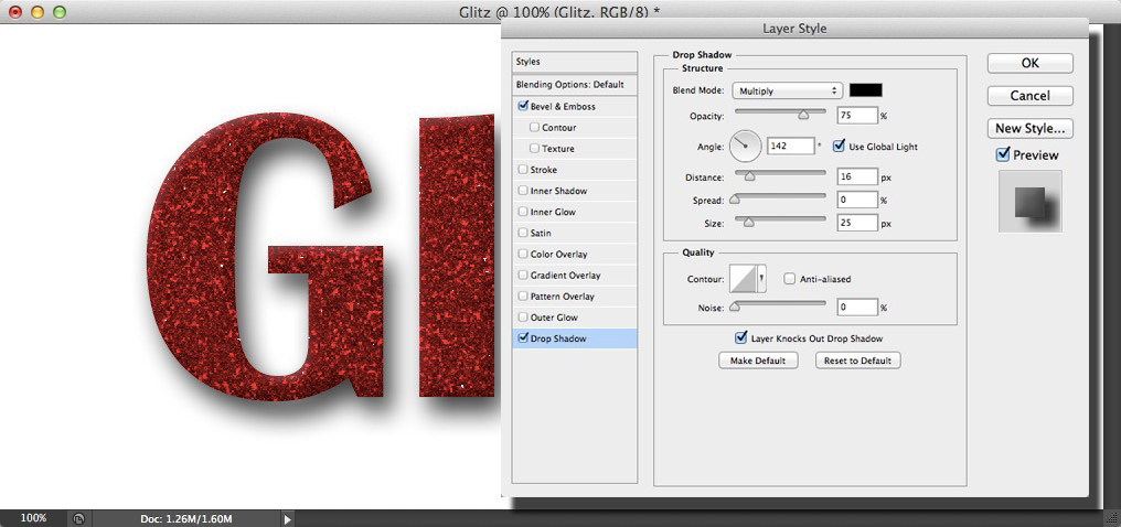 11. We’ll add a drop shadow to set the text away from the background. Click the Drop Shadow item in the list. Change the size to around 25px to soften the shadow. Move the cursor onto the image. Click and drag to change the angle and distance of the shadow interactively; this is much easier to manage than using the dialog controls. Notice how the angle of the text’s bevel also changes; this is governed by the Global Light settings. Once the shadow is in position, click OK to apply the settings.
 12. Now for the background. Click the background layer’s thumbnail to make it active. Go to Edit > Fill. Select Color for the contents. The colour picker will appear. Green makes a nice contrast to the red. Here we’ve used the following settings: R42, G119, B18. Click OK to apply the fill. The text is a little lost in all that space; we’ll use a vignette to focus in on it.
 13. Grab the Elliptical Marquee tool from the Toolbox, or press Shift+M to cycle through the options. Click and drag from the top-left corner of the image down to the bottom-right to make an elliptical selection. This will be used to create a mask cut-out so before we continue we need to invert the selection. This can be done by either going to the Select Menu and choosing Inverse, or by pressing Cmd+Shift+I/Ctrl+Shift+I on the keyboard.
 14. With the selection in place, we can create the adjustment layer. Go to Layer > New Adjustment Layer > Levels. Click OK to accept the defaults. We don’t see any difference yet but looking in the Layers panel, we can see that the selection has created a black ellipse in the mask. Go to the Properties panel. Drag the right-hand slider of the Output Levels toward the left. As we do this the outer part of the background begins to darken down. Drag it across to around the half-way mark. The transition is obviously too harsh at the moment.
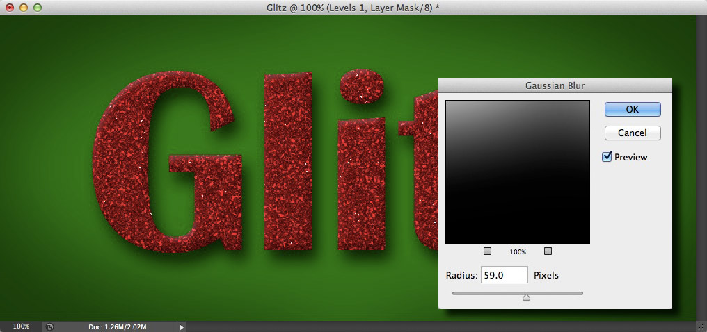 15. Make sure the adjustment layer’s mask is active by clicking its thumbnail. Now go to Filter > Blur > Gaussian Blur. Set the radius to a fairly large amount; around 50-60 pixels here. This gives us a nice transition between the light and dark; drawing the eye to the centre of the image. If the vignette appears a little too strong, or not strong enough, we can always go back to the properties panel and adjust the Output slider again.
 16. We’re almost done! Shiny surfaces, particularly illustrated ones, have a much better presence if we have some sparkling catchlights. Select the Brush tool from the Toolbox, or press its keyboard shortcut B. Open the brush presets panel. Now click the fly-out menu on the right. Click Load Brushes. Navigate to where you saved the Sparkle Brush file. Click Open. The new brush will appear as the last entry in the window. Click to select it.
 17. Create a new layer at the very top of the layer stack. Make sure white is selected as the foreground colour. Reduce the brush size down with the size slider, or by pressing the left square bracket key a few times; a size of around 30px is about right. Now go around the lettering clicking once at random spots; the brighter flecks of the texture are good places. Notice as the brush is stamped down, the size and angle changes slightly; this gives us a nice variance in the flares. Don’t overdo it, we just want a few accents to give the impression of sparkling light on the glitter.
 And here’s our finished image. I hope you enjoyed the tutorial and have found it useful for your own projects.
Until the next time, all the best!
David


Definitely “My Man” with the Text. It’s like learning to write all over again – thanks David.
BEAUTIFUL TEXT
Nice effect. It is easy and cool. thank you.