
5 Ways: Photoshop Color Correction
(Note: In the 5 Ways series I’ll list five ways to do some restoration technique in Photoshop. For each of the five ways in each series I’ll use the same image. These 5 ways are not necessarily the best ways, and certainly not the only ways, to do the featured technique in Photoshop; they’re simply the first 5 that entered the authors mind.)

I’ve been doing this Photoshop / restoration / retouching thing a long time now and I can pretty well tell just by looking what type of color correction will work on what type of fading or color cast. Curves work really well on a certain kind of orangey-red cast that’s indicative of 1970’s chain store images while nothing short of a black and white adjustment and a hand tint will work on a particular sun faded yellow cast. I do, however, try more than one method on each image just to be certain I’m getting the best result.
For my 5 Ways I’m going to list the five methods that pop in my head first. They won’t always be the most popular and some might be downright odd, but there are so many ways to do any one thing in Photoshop and, frankly, the best way to do anything is the way that gives you the best result. Always using Curves, for instance, is severely limiting your potential outcome. We’ll start the 5 Ways of Color Correction with the most obvious method:
1. Curves adjustment. When most people think of Color Correction in Photoshop they think of Curves; it’s the go-to workhorse of Color. One click on the dark area of an image with a color cast will sometimes yield almost magical results; suddenly there’s color where before there was none or the color is more pronounced and vibrant where before it was faded and dull. Curves are by far the most used method of color correction, though it doesn’t work 100% of the time and even if it does work, sometimes it’s not the best result.

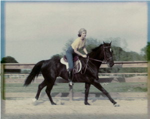
In this particular image the Curves adjustment has taken care of the red cast, but it hasn’t done much to restore vibrancy. In fact, the shadows dropper sampled under the horses’ neck has left the image with a distinct yellow tinge. Another sample with the midtone dropper took care of that. I found the best result in the shadow area of the fence. Have I mentioned that restoration is largely about experimenting? Use that midtone dropper in different places and see if any improvement happens.
2. Camera Raw. Yes, Camera Raw, specifically the Camera Raw filter inside Photoshop CC and CC 2014. It would still work in ACR, of course, but this is just so much more convenient. Color Correction in ACR is really all about moving those sliders, the most important in terms of color correction being the Temperature, Vibrance, Saturation and sometimes Tint.
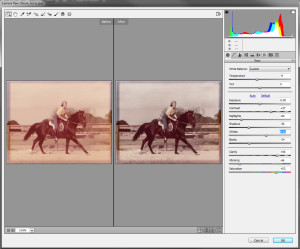
It’s not always the be-all, end-all and more often than not you will need to package it with another method to get a better result. In this case, using a Curves adjustment cut the red cast quite a bit. I could have worked in Camera Raw further to get the red out, but I was going for some instant gratification – and I also want to show double dipping methods and this was a good opportunity…

3. Channel Mixer. An often over looked color correction tool, the Channel Mixer adjustment does just what the name implies, it allows you to mix the RGB color channels to get a good result.

This does a great job, obviously, of getting rid of all hints of color cast. What it can’t do, though, is bring any depth back into the image. Once again, a run through the Curves adjustment can make a difference. It’s up to you to decide whether it actually looks better, though.

It could be said that the tonal quality has been improved by the Curves adjustment, so why not throw in a Hue / Saturation adjustment and try to bring out some of the original color?

The yellow is a little yellower, the blue a tiny bit brighter, but remarkably improved? Probably not, but always worth trying!
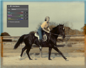
4. Color Balance. Color correction with Color Balance works a little like the channel mixer, only it works in the CMYK color shpere, minus the black. You also work in Highlights, Midtones and Shadows and you really need to work in all three to have a good result. A lot of times I can get a good result off this method alone, but I still add a Curves adjustment afterwards just to see if it helps anything.
5. Lab Color. I’ll admit I don’t go into the Lab color space very often. It just never pops into my head right away – one reason its number five. Another reason is that I decided to go outside my personal comfort space for one of the five. Due to Lab having a Lightness channel, I was able to help the tonal quality while correcting the color with the a and b channels. Someone with more Lab expertise could get a much better result, I daresay, but not too bad for a Lab rookie.

The one thing I’d like to work on with the Lab image is the blue artifact that was showing up. More work would have to be put into mask the artifact out, certainly. It’s also way too bright for me. I’d probably overlay it on one of the other methods and take the opacity down, but that’s just me. A side note concerning all the color correction methods on this particular photo: certain areas, such as the skin, never really came up to scratch. Personally I would add some skin tone and use a Layer Blend Mode to bring those areas up to snuff.
So there we have the first 5 color correction methods that popped into my head. These may, or may not be the ones you would use, or even how you would use them, but that doesn’t make them right or wrong, just different. I usually use more than one and blend then unless I come across that rare image that corrects beautifully in one try. If you use other methods, feel free to share in the comments!

Wonderful color correction tips.Great write hare.